Widgets
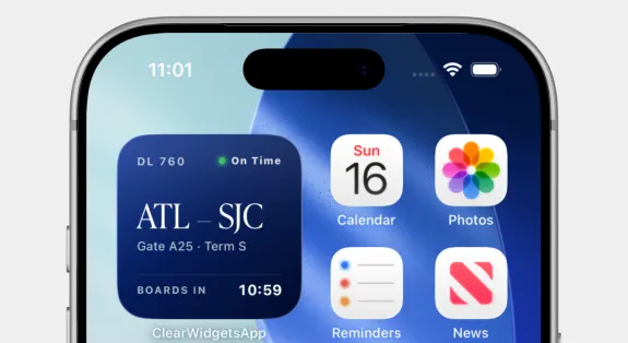
Home-screen widgets that surface the travel day — gate, boarding time, and checkpoint status — without opening the app.

Context
The most valuable moments in the CLEAR app are also the briefest: a member checking whether it's time to head to the gate. Home-screen widgets bring that answer to the surface, turning a full app session into a single glance.
Problem
Time-sensitive travel information — gate, boarding time, terminal — lived one or two taps deep in the app, so members repeatedly opened and closed CLEAR just to re-check a detail that changes throughout the day.
Role & Approach
I designed the widget family across sizes, deciding what each one should show and how it adapts as the travel day progresses. The priority was a widget that's useful before a member ever taps it.
Process
I audited what members check most on travel day, then mapped those data points to widget sizes — small for a single next-up detail, larger for the fuller picture. I designed each to update through the day so the widget always reflects the current moment, not the last time the app was opened.
User Journey
A member glances at their home screen and sees their flight — ATL to SJC, Gate A25, boarding at 10:59 — alongside the day's essentials, deciding their next move without a single tap.
Constraints
Widgets refresh on the system's schedule, not on demand, so the design had to stay useful even when data was a few minutes stale — communicating timing honestly and degrading gracefully between updates.
Summary
CLEAR's home-screen widgets put the travel day one glance away — gate, boarding time, and status — so members spend less time in the app and more time moving.
Next Steps
Live and iterating. Next up: Lock Screen widgets and interactive controls that let members act on the day without opening the app.