Locations
Real-time wait times, lane availability, and TSA PreCheck eligibility — surfaced the moment members need it.

Context
Before heading through security, CLEAR+ Members need to know which lanes are open, how long the wait actually is, and whether their TSA PreCheck status applies at that location. The redesigned location detail screen surfaces all three at a glance, cutting the back-and-forth members previously did between the app and the actual checkpoint.
Problem
Members arriving at a terminal had to piece together lane availability, wait times, and PreCheck eligibility from separate, unclear parts of the app — often while already walking toward security. That friction was worst at large or multi-checkpoint airports, where picking the wrong lane cost members real time instead of saving it.
Role & Approach
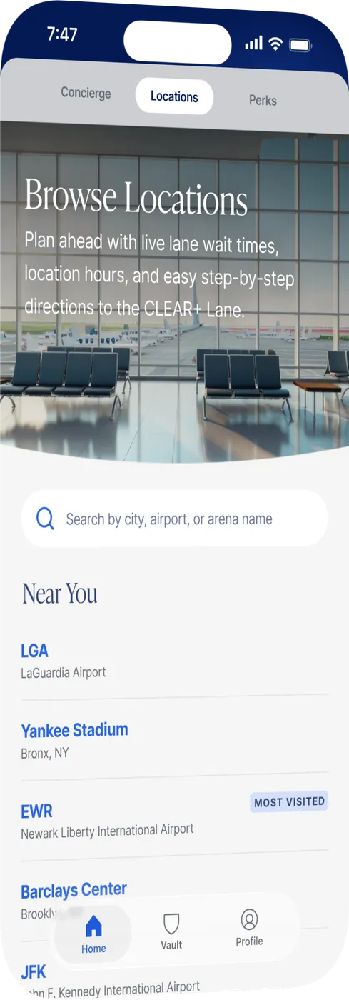
I owned the redesign of the location detail screen end to end — auditing the existing flow to find where members were dropping off or backtracking, then rebuilding the information hierarchy around the three decisions a member actually needs to make in the moment: which lane, how long, and am I eligible.
Process
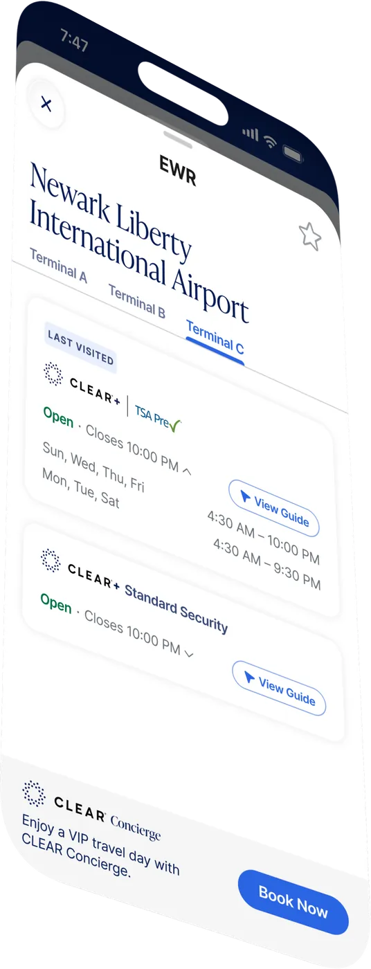
I started by mapping every data point the existing screen surfaced against what members actually acted on, then stripped the screen down to real-time wait times, lane availability, and PreCheck requirements as the primary content. I iterated on layout and visual hierarchy so the most time-sensitive information — current wait and open lanes — was scannable in under a second, with PreCheck details available without extra taps.

User Journey
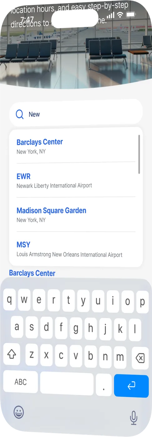
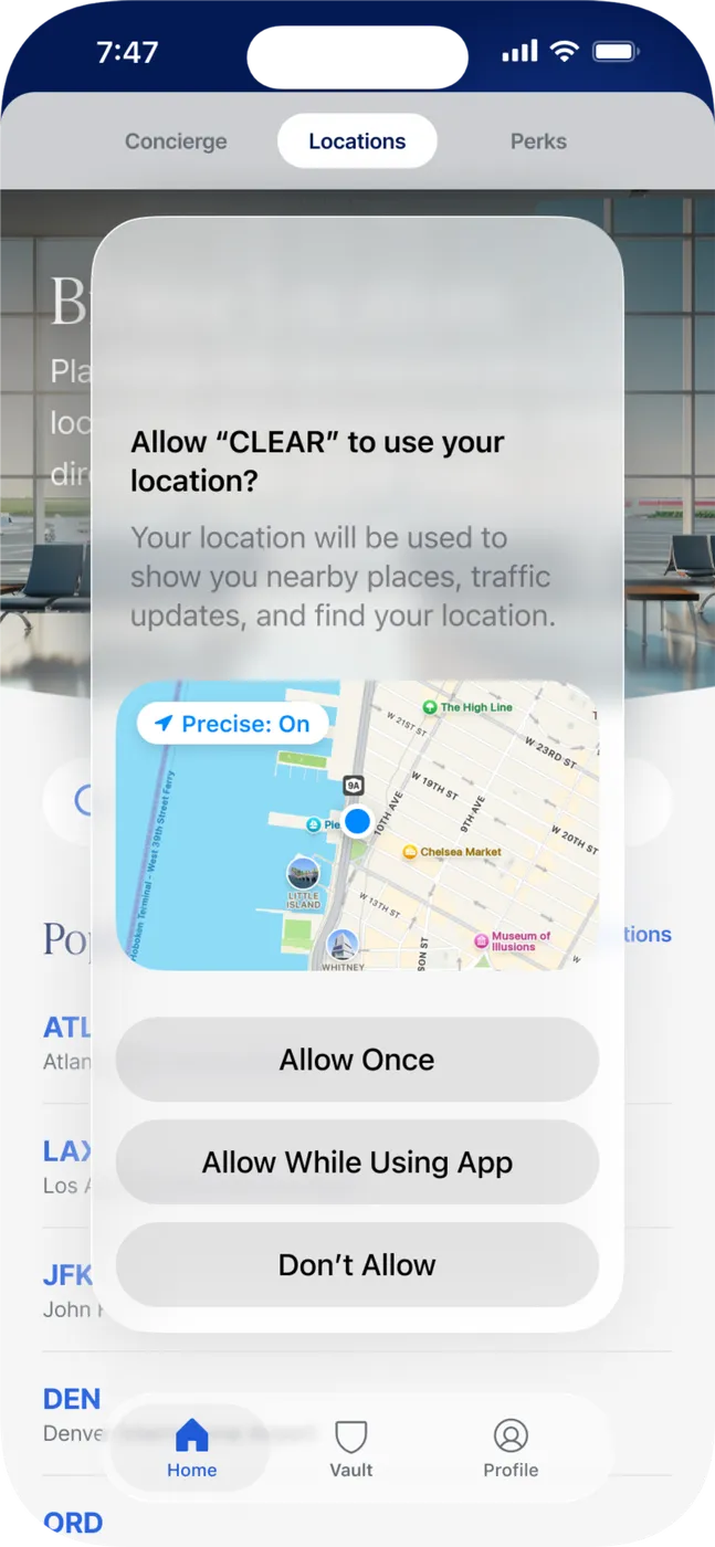
A member opens the app while approaching the terminal and searches for their location. The detail screen immediately surfaces live wait times and which lanes are open, so they can head straight there. If their PreCheck status affects which lane they should use, that's surfaced inline — no digging through settings or a separate screen to confirm eligibility.
Constraints
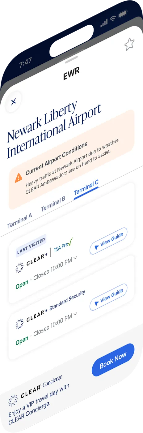
Wait time and lane data come from systems with varying update frequency across locations, so the design had to communicate confidence and freshness honestly rather than presenting every figure as equally real-time. The screen also had to stay legible for members quickly glancing at their phone mid-walk, not sitting down to read.

Before / After
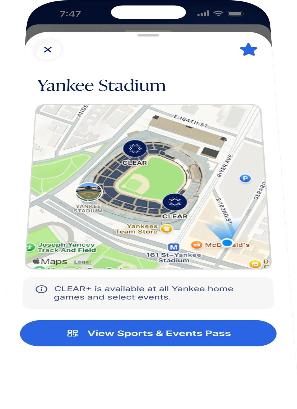
Before: members navigated multiple screens and unclear labeling to piece together lane status, wait times, and PreCheck eligibility. After: one screen surfaces all three up front, reducing the time members spend navigating the app once they're at the terminal.

Summary
The redesigned location detail screen gives CLEAR+ Members real-time wait times, available lanes, and TSA PreCheck requirements in one glanceable view — reducing the time members spend navigating the app at the terminal and getting them to the right lane faster.
Next Steps
Live and iterating. Next up: extending real-time accuracy to more locations, and exploring proactive lane recommendations based on a member's PreCheck status and current wait data.