The Values Bridge
A guided framework for turning personal values into actionable insights.
Context
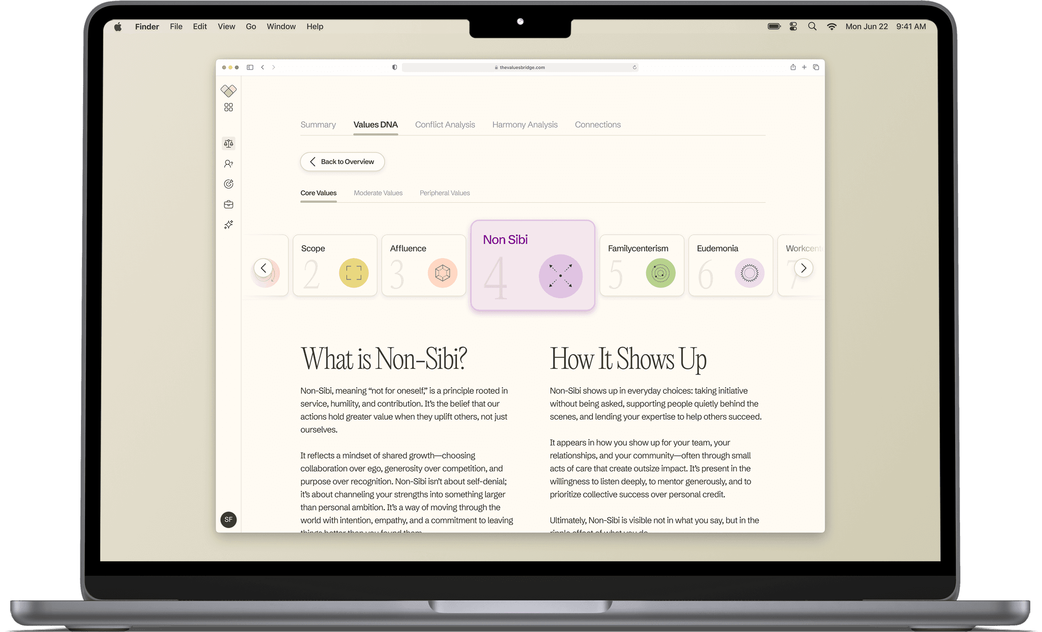
Over 8 weeks, I designed a calm, system-driven assessment that helps high-achieving adults turn abstract values into concrete decisions.
Role
Head of UX
Platforms
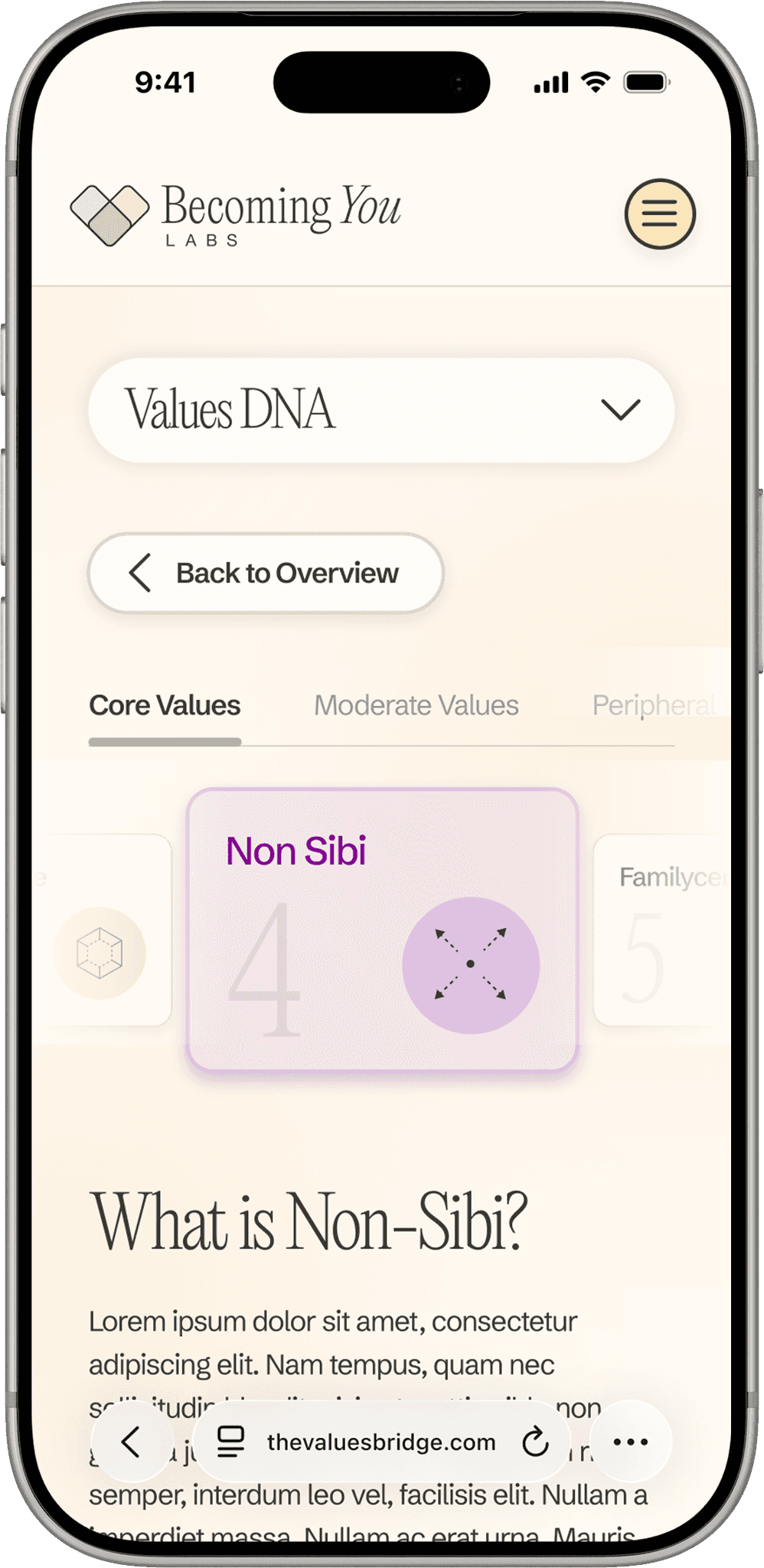
Web-based, desktop and mobile
Company
Becoming You Labs
Timeframe
2025
Scope
Product strategy, UX design, content design, visual design, brand system
Team
Product manager, 2 engineers, 2 product designers